SmartGuard

Industry
Home Security · Smart Home Technology
January - May 2025
Duration
Role
Sole Product designer + Brand designer
Project Overview
A smarter way to feel safe at home.
Smartguard is a mobile-first security app designed to make protection simple, not stressful. I owned the full design
process end to end - from research to user flows to a polished branded prototype that reimagines what home
security should feel like.
The Problem
Security that felt complicated, not comforting.
Most smart home apps were built around features, not feelings. The result was cluttered dashboards, confusing
setup flows, and alert systems so noisy users stopped paying attention.
Research & Insights
People didn't feel protected, they felt
overwhelmed.
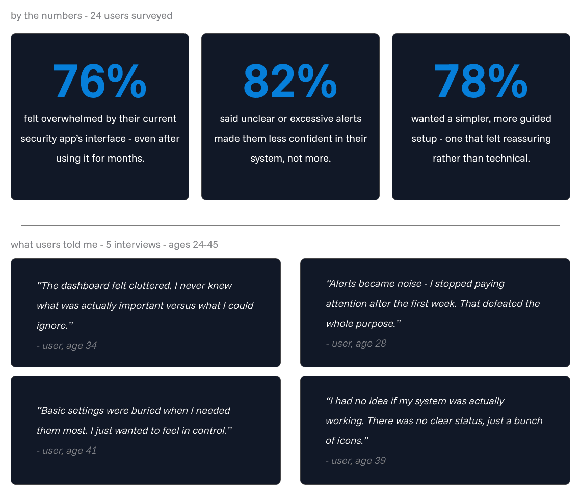
I studied how people interacted with existing security apps like Ring and Google Home, and spoke directly with users
about their daily experience. The problem wasn't a lack of features — it was a lack of clarity. Users had powerful tools
they didn't trust or understand.
Define
Behind every alert, there's a person
just trying to feel safe.
The research pointed to a clear emotional pattern - users weren't confused because the technology was bad.
They were anxious because the experience never made them feel in control. Before designing a single screen
I mapped that emotional reality.


Ideation & Wireframing
Designing for calm, not complexity.
With the emotional reality mapped and the full user journey defined, I moved into design with one guiding
principle — every screen should reduce anxiety, not add to it. Each decision was made in service of
clarity, trust, and simplicity.
Dashboard
Status at a glance - no hunting, no guessing.
The dashboard needed to answer one question immediately — is everything okay? A clean status indicator,
camera thumbnails, and a simple alert feed replaced the cluttered layouts users described in research.

Camera View
Immersive, distraction-free, and in control.
Users wanted to feel present when checking their cameras — not like they were navigating a settings menu.
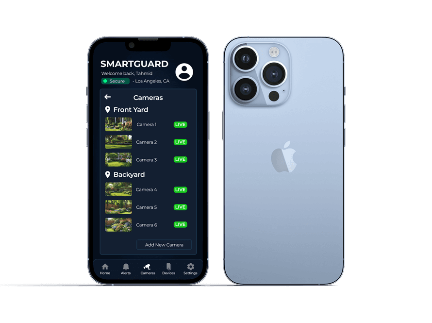
Full screen feed, minimal UI, essential controls only.

Add camera flow
Setup that felt guided, not intimidating.
The three step flow was designed to feel like a conversation - one decision at a time, clear progress indicators, and
reassuring confirmation at the end

Alerts Screen
Only what matters, when it matters.
Alert fatigue was one of the biggest pain points from research. The alerts screen was designed to surface priority
information clearly without overwhelming the user.

Final Design Highlights
Security that finally feels like peace of mind.
SmartGuard brings clarity, trust, and simplicity together - a clean dashboard that tells you everything at a glance,
immersive camera views that keep you present, and guided flows that make setup feel effortless. Every screen was
built around one goal: make the user feel safe, not stressed.


Reflections & Learnings
Designing for trust taught me to trust the
process.
This project taught me that the best design solutions often come from subtraction, not addition. Users didn't
need more features - they needed fewer decisions. Every screen I simplified, every alert I prioritized, every
step I removed made the experience stronger.
Working through the full process - from research and empathy mapping to wireframes and hi-fi -
showed me how much clarity you gain when you stay grounded in real user pain points rather than assumptions.
Most importantly, SmartGuard reminded me that designing for emotion is just as important as designing for function.
Making someone feel safe is a design problem too.