GamerGear
Industry
E-commerce · Retail · Consumer technology
July 2025 (4 weeks)
Duration
Role
Sole product designer + Brand designer
project overview
Leveling up how gamers shop.
GamerGear reimagines the online shopping experience for gamers, transforming a cluttered and tedious
process into something streamlined, bold, and built for their culture.

The Problem
Shopping for gaming gear shouldn't
feel like a boss battle.
Most gear sites are built for mass-market buyers, not gamers. The result is cluttered layouts, endless clicks, and an
uninspired shopping flow that drains the fun out of finding gear.
Research & Insights
Players felt lost, tired, & uninspired when
shopping for gear.
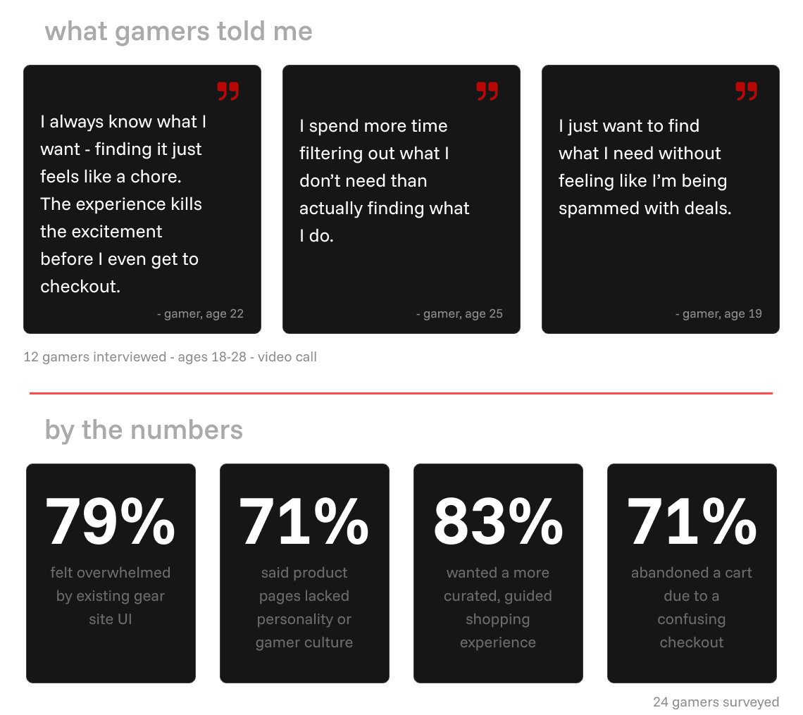
To understand why, i spoke with gamers and surveyed how they actually shop for gear online. What i found
was consistent - existing platforms were failing gamers not just in design, but in culture, nobody was building for them.

Define
Behind every data point, there's a person.
Marcus isn't just a persona, he's every gamer who's ever rage-quit a checkout flow. designing for him
meant designing for all of them.


Ideation & Wireframing
From frustration to first drafts.
With a clear user in mind and three guiding goals - clarity, efficiency, and identity - I moved into ideation. each screen
started as a wireframe focused purely on structure and flow, then evolved into a high-fidelity design that brought the
gamergear brand to life.
Wireframing The Home Page
Shaping a clear, guided path for gamers.
Bold hero banner, clear categories, immediate direction - designed so players never feel lost.

Wireframing The Product Page
Surfacing clarity and confidence.
Essential details, rich visuals, and a bold cta - everything needed to decide without having to leave the site.

Wireframing The Cart & Checkout Page
From cart to confirmed in as few steps
as possible.
A single streamlined path that keeps momentum alive all the way to purchase.


Final Design Highlights
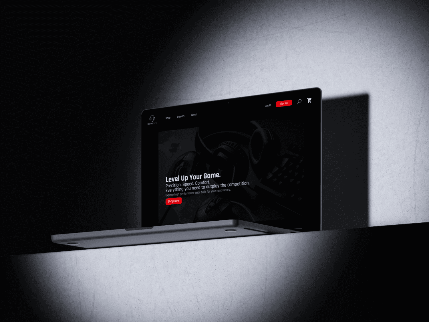
GamerGear was built to outplay the
competition, literally.
GamerGear brings clarity, efficiency, and identity all together - with bold visuals, effortless navigation, and a
high-energy flow that keeps players confident through checkout.


Reflections & Learnings
Outplaying the competition started with
outlearning myself.
This project taught me that great design starts with real people, not assumptions. talking to gamers and studying
competitors revealed how cluttered interfaces and scattered CTas don't just frustrate users, they kill momentum and
confidence.
Wireframes gave me the freedom to test flows quickly, while high-fidelity prototypes showed how clarity and energy
emerge when you stay true to your core goals.
Most importantly, designing for a specific audience is more powerful that designing for everyone. building for gamers
meant leaning into bold visuals, streamlined flows, and cultural cues that made shopping feel like part of their world
- not just another e-commerce site.
Other Projects